


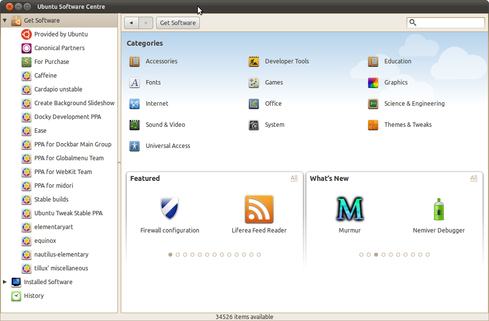
The Software Centre has been included in the last three Ubuntu released Karmic (9.10), Lucid (10.04) and Maverick (10.10) but for each release its interface has changed. The next version of the Software Centre (version 4.0) should I think take a step forward in terms of its interface. The next release will be a milestone in itself as it will allow users to rate apps and donate money to their favourite open source projects. But as other operating systems see the potential a desktop app store has ( the Mac App store, Chrome webs store and the rumoured software store in Windows 8) its time the software centre takes a leap forward and has an interface that is both modern and beautiful. I admit some of my inspirations for this mock-up came from Windows Phone 7, Vuze, Finder and Nautilus-elementary.

The sidebar now looks much neater, and is inspired by the Vuze sidebar as well as the sidebars on the Finder and Nautilus-elementary. It displays the number of updates available and shows the number of applications being installed. The style of the numbers of updates/installs is similar to the way the number of emails/messages you have are displayed in the messaging menu.
The main interface is based on the tile interface on the Windows Phone 7 operating system. All of the 13 categories are displayed as 'tiles' and the sizes of the the various categories depend on how many items are available under that category, for example the system category has 28151 items (on my computer) making it the largest category and Universal Access has only 13 items making it the smallest category.
This is a very early design that literally came into my head a couple of days ago so it will require some refinement. The Software centre despite over a year of work and improvement still looks bland and empty, this design is just that a design but I think some of the ideas I have presented through it could definitely be incorporated into the next version of the Software Centre, i.e a more efficient use of space and showing updates.
0 comments:
Post a Comment